
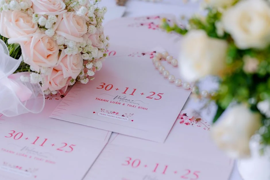
Invitation printing remains one of the most effective ways to set expectations for an event before a guest ever arrives. A printed invitation does more than communicate a date, time, and location; it signals formality, tone, and care. When a recipient holds a card in their hands, the tactile experience communicates intention in a way a digital message rarely matches. Paper weight, surface texture, color fidelity, and finishing details all work together to create anticipation. For weddings, milestone birthdays, corporate galas, religious celebrations, and community fundraisers, the invitation is often the first branded touchpoint. That early touchpoint influences attendance, guest preparedness, and even the perceived value of the event. The psychology is simple: people tend to respond more thoughtfully to something they can physically keep on a countertop or pin to a board. That visibility can translate to higher recall and fewer missed dates. For hosts, printed pieces also provide a sense of permanence and craft, especially when the design reflects the theme and the messaging feels personal and deliberate.
Table of Contents
- My Personal Experience
- Understanding Invitation Printing and Why It Still Matters
- Choosing the Right Format: Flat Cards, Folded, Suites, and More
- Paper Choices: Weight, Texture, Color, and Durability
- Printing Methods: Digital, Offset, Letterpress, Foil, and Thermography
- Design and Typography: Readability, Hierarchy, and Style
- Invitation Printing for Weddings: Suites, Etiquette, and Consistency
- Corporate and Business Events: Branding, Professionalism, and ROI
- Mailing Considerations: Envelopes, Postage, and Postal Compliance
- Expert Insight
- Proofing and Prepress: Avoiding Costly Mistakes
- Finishing Touches: Cutting, Rounding, Embellishments, and Packaging
- Budgeting and Quantity Planning: Getting Value Without Compromise
- Sustainability in Invitation Printing: Responsible Materials and Practices
- Working With a Print Shop: Communication, Timelines, and Best Results
- Making Invitation Printing Feel Personal: Customization and Meaningful Details
- Final Thoughts: Bringing It All Together for Confident Invitation Printing
- Watch the demonstration video
- Frequently Asked Questions
- Trusted External Sources
My Personal Experience
When I decided to print our wedding invitations myself, I thought it would be a quick weekend project—until I realized how many tiny choices were involved. I ordered a few paper samples first, and I’m glad I did because the “bright white” cardstock I picked online looked almost blue under our living room lights. After a couple test runs, I adjusted the printer settings to stop the ink from smudging and learned to feed the heavier stock one sheet at a time so it wouldn’t jam. The first batch came out slightly off-center, so I made a simple template and reprinted them, which cost me more time than money but saved my sanity. In the end, sealing the envelopes and seeing the finished stack on the table felt oddly satisfying—like all the fiddly details finally added up to something real. If you’re looking for invitation printing, this is your best choice.
Understanding Invitation Printing and Why It Still Matters
Invitation printing remains one of the most effective ways to set expectations for an event before a guest ever arrives. A printed invitation does more than communicate a date, time, and location; it signals formality, tone, and care. When a recipient holds a card in their hands, the tactile experience communicates intention in a way a digital message rarely matches. Paper weight, surface texture, color fidelity, and finishing details all work together to create anticipation. For weddings, milestone birthdays, corporate galas, religious celebrations, and community fundraisers, the invitation is often the first branded touchpoint. That early touchpoint influences attendance, guest preparedness, and even the perceived value of the event. The psychology is simple: people tend to respond more thoughtfully to something they can physically keep on a countertop or pin to a board. That visibility can translate to higher recall and fewer missed dates. For hosts, printed pieces also provide a sense of permanence and craft, especially when the design reflects the theme and the messaging feels personal and deliberate.

Modern invitation printing is also far more flexible than many assume. While classic flat cards remain popular, today’s print workflows allow for short runs, variable data, personalized names, custom inserts, and coordinated day-of stationery without requiring enormous budgets. Digital presses can produce vibrant color with fast turnaround, while traditional methods such as letterpress and foil stamping offer unmistakable luxury. The best results come from aligning the printing method with the event’s tone, the design style, and practical considerations like mailing requirements and timelines. When hosts consider how guests will receive and interact with the invitation, they can make choices that look beautiful and function smoothly. Even as digital communication dominates everyday life, physical invitations retain a special status because they represent commitment—both to the event and to the people being invited. That’s why investing thought into format, paper, and production details continues to pay off for hosts who want their event to feel memorable from the start.
Choosing the Right Format: Flat Cards, Folded, Suites, and More
Format is the first major decision that shapes the entire experience of invitation printing. A flat card is straightforward: it’s economical, clean, and ideal for events that don’t require much information. A folded invitation adds space for details and can feel more formal because it creates a small “reveal” moment as the recipient opens it. Invitation suites—typically a main invitation plus separate cards for RSVP, details, accommodations, reception, or directions—are common for weddings and multi-day events. They provide clarity and prevent overcrowding the main card. For corporate events, a flat invitation paired with a folded agenda insert may balance simplicity and usefulness. For informal gatherings, a postcard format can be both charming and budget-friendly, though it offers less privacy for the text and can be more exposed to postal handling.
Beyond the basic shapes, there are creative structures that elevate a printed piece without sacrificing readability. Gatefold invitations open from the sides to the center, creating a dramatic presentation. Pocket invitations hold multiple inserts neatly and can include maps, RSVP cards, and even small keepsakes. Die-cut shapes can echo a theme—think arches, florals, or modern geometric silhouettes—though they require careful planning to avoid complications in mailing. When deciding, consider how much information guests truly need and where that information is best placed. Overloading a single card can look cluttered and reduce legibility, while too many inserts can feel confusing if not organized. A thoughtful format supports both aesthetics and function, guiding the eye naturally and helping guests act quickly, whether that means saving the date, RSVPing, or planning travel. Good invitation printing starts with a format that respects the guest’s experience as much as the host’s design vision.
Paper Choices: Weight, Texture, Color, and Durability
Paper selection is one of the most influential factors in invitation printing because it affects appearance, feel, and even how ink behaves. Heavier cardstock generally conveys quality, but weight alone is not the whole story. A smooth, coated stock can make colors appear more saturated and crisp, which is ideal for photo-heavy designs or bold graphics. Uncoated papers, including cotton blends and textured sheets, can create a softer, more artisanal look that suits minimalist typography, watercolor illustrations, or classic motifs. The paper’s brightness also matters: bright white makes colors pop and text look sharp, while warm white or ivory can feel romantic and traditional. Colored stocks can be beautiful, but they require careful ink selection to maintain contrast and readability, especially for small text.
Durability becomes important when invitations are mailed or handled frequently. A delicate paper might scuff, show fingerprints, or bend in transit. If the design includes heavy ink coverage, uncoated paper may absorb ink and reduce sharpness unless the press is calibrated appropriately. Specialty papers—like handmade sheets with deckled edges—create a striking aesthetic, but they can vary in thickness and may complicate automated trimming or envelope insertion. A practical approach is to request printed samples or at least paper swatches before committing. Consider how the invitation will be stored by guests; a thick, sturdy card is more likely to be kept as a memento. Also think about the supporting pieces: RSVP cards often need a smoother stock for easy writing, while envelopes may need a paper that seals reliably. Balancing tactile luxury with real-world usability leads to invitation printing that looks premium and performs well from production to delivery.
Printing Methods: Digital, Offset, Letterpress, Foil, and Thermography
The printing method determines not only the final look but also the production timeline and cost structure of invitation printing. Digital printing is widely used because it handles short runs efficiently, supports variable personalization, and offers fast turnaround. It is excellent for full-color designs, modern layouts, and events where the host might need last-minute adjustments. Offset printing, while typically more cost-effective at higher quantities, provides extremely consistent color and can reproduce fine details with precision. It’s especially useful when exact brand colors are required for corporate events or when large batches need uniformity. Both digital and offset can be paired with specialty finishes, but the base method should match the design’s complexity and the quantity needed.
For tactile luxury, letterpress remains a favorite. It presses ink into the paper, leaving an impression that feels handcrafted and elegant. Letterpress works best with simpler designs, limited colors, and thicker cotton stocks that can take an impression without cracking. Foil stamping adds metallic shine—gold, silver, rose gold, holographic, and custom colors—and creates a high-end look that photographs beautifully. Thermography, often used for formal stationery, creates raised ink by applying powder and heat, resulting in a glossy, embossed-like effect at a lower cost than true engraving. Each method has constraints: foil requires clean vector artwork and careful registration; letterpress can distort very small type; thermography can be less refined on ultra-modern designs. The smartest invitation printing choices come from aligning method with purpose: a minimalist wedding invitation may shine with letterpress and blind deboss, while a vibrant gala invite may be best served by high-quality digital printing plus spot UV accents.
Design and Typography: Readability, Hierarchy, and Style
Strong design is the backbone of invitation printing because it ensures the message is not only beautiful but also easy to act on. Hierarchy is essential: the event type or host name often leads, followed by the occasion, date, time, venue, and RSVP instructions. When hierarchy is unclear, guests may miss crucial details or feel uncertain about dress code, arrival times, or whether plus-ones are included. Typography should balance personality with legibility. Script fonts can convey romance and tradition, but they can become difficult to read at small sizes or when printed on textured paper. Sans-serif fonts feel modern and clean but can seem stark if not paired thoughtfully with spacing and decorative elements. Many successful layouts use a combination: a display font for names or a headline, and a highly readable serif or sans-serif for details.

Color and contrast also determine how well an invitation performs. Light gray text on cream stock may look subtle on screen but can be hard to read in real life, especially under warm indoor lighting. Similarly, metallic inks and foils can reduce readability if used for body text rather than accents. White space is not wasted space; it frames the content, makes the piece feel intentional, and helps guests scan quickly. Another practical consideration is how the design prints: gradients, very thin lines, and tiny dots may not reproduce well on certain stocks or with certain methods. Proofing is critical for invitation printing because small errors become expensive mistakes when multiplied across a batch. A design that looks stunning and reads effortlessly is the goal, and that requires testing the layout in print conditions, not just on a screen.
Invitation Printing for Weddings: Suites, Etiquette, and Consistency
Weddings often involve the most detailed invitation printing because guests may need travel information, multiple event schedules, and clear RSVP guidance. A cohesive suite helps keep everything organized: the main invitation sets the tone, while detail cards cover accommodations, transportation, registry links, and weekend itineraries. Consistency across pieces—matching fonts, motifs, and paper—creates a polished look. It also helps guests understand which cards belong together. For example, a rehearsal dinner invitation might echo the wedding stationery but with a distinct accent color to prevent confusion. Envelope addressing, whether printed or hand-calligraphed, is another important element because it affects first impressions and deliverability. A well-planned suite can also include practical additions like belly bands, wax seals, or vellum wraps, though these should be chosen with mailing durability in mind.
Etiquette and clarity work together. Guests appreciate direct instructions: RSVP deadlines, meal selections if applicable, dress code wording that is specific without being rigid, and a clear indication of whether children are invited. Many couples use a wedding website for extended details; if so, the printed pieces should guide guests there without replacing essential information. That balance ensures the invitation stands alone while still offering digital convenience. Timing is also critical: save-the-dates are often sent months in advance, while invitations go out closer to the date. Coordinating these timelines with printing schedules prevents rushed decisions and shipping delays. Wedding invitation printing can feel overwhelming, but a structured approach—finalizing wording, confirming quantities, selecting paper and method, and approving proofs—turns it into a manageable process that results in stationery guests will keep and remember.
Corporate and Business Events: Branding, Professionalism, and ROI
For corporate gatherings, invitation printing is a brand exercise as much as it is an informational tool. A printed invitation can signal exclusivity for a product launch, communicate prestige for an awards dinner, or reinforce trust for a client appreciation event. Brand consistency matters: colors should align with existing guidelines, typography should match brand standards, and the overall design should feel like an extension of the company’s identity. Even small touches, such as a subtle logo emboss or a color-matched envelope liner, can elevate perception. Unlike casual invites, corporate pieces often need to accommodate legal disclaimers, access requirements, or registration instructions. The challenge is to include these details without overcrowding the design. This is where inserts, folded formats, or QR codes can help maintain a clean layout while still providing necessary information.
Return on investment is a practical lens for business printing decisions. A premium piece may cost more per unit, but if it improves attendance among high-value stakeholders, the payoff can be substantial. For ticketed events, clear calls to action and frictionless RSVP processes matter. Variable data printing can personalize invitations with recipient names, unique registration links, or coded tickets, helping track responses and reduce fraud. Mailing logistics also matter in corporate settings: bulk mailing, consistent addressing formats, and adherence to postal standards can reduce delivery issues. When executed well, invitation printing becomes part of a broader experience design that starts at the mailbox and continues through signage, programs, menus, and follow-up cards. The result is an event that feels cohesive and intentional, supporting both relationship-building and brand credibility.
Mailing Considerations: Envelopes, Postage, and Postal Compliance
Mailing is where beautiful invitation printing can succeed or fail, because the best design still has to arrive in good condition. Envelope choice should match the invitation’s size and thickness while leaving room for inserts without overstuffing. A snug envelope can cause bending, while an oversized one may increase postage costs. Paper texture and color influence how addresses appear; dark envelopes may require white ink, metallic ink, or labels, each with different durability and readability. If using calligraphy, consider smudging risks and drying time, especially on coated envelopes. Envelope liners add elegance but also weight, which can affect postage. Seals, wax, and decorative closures can be eye-catching, but they may trigger non-machinable surcharges or cause damage in sorting machines unless properly protected.
Expert Insight
Choose paper and finishes that match the tone of the event, then request a printed proof to confirm color accuracy and readability under real lighting. Keep type sizes practical (at least 10–11 pt for body text) and maintain strong contrast so key details are easy to scan. If you’re looking for invitation printing, this is your best choice.
Lock in your wording and guest list before sending files to print, and build in extra time for revisions, production, and shipping. Order 10–15% more than needed to cover last-minute additions, misprints, and keepsakes, and include matching envelopes to avoid sizing surprises. If you’re looking for invitation printing, this is your best choice.
Postal compliance is not glamorous, but it protects your budget and timeline. Thickness, rigidity, and unusual shapes can require additional postage and manual processing. Before sending a large batch, it’s wise to assemble a complete invitation with all inserts and take it to the post office for a weight check and a machinability assessment. This step can prevent returned mail and unexpected costs. Address formatting also matters: using standardized abbreviations and including ZIP+4 when possible can improve delivery speed. Return addresses should be consistent and easy to read. For time-sensitive events, building in buffer time is essential; even perfectly prepared mail can be delayed by weather, holidays, or regional processing issues. Mailing is a core part of invitation printing strategy, because it ensures that the piece not only looks impressive but also reaches guests reliably and on schedule.
Proofing and Prepress: Avoiding Costly Mistakes
Proofing is the most important safeguard in invitation printing, because small errors can be expensive and emotionally frustrating. Content proofing starts with names, dates, times, venue addresses, and RSVP instructions. It sounds obvious, but mistakes happen when details change late or when multiple people contribute edits. A disciplined workflow helps: finalize wording in a shared document, confirm it against vendor contracts and venue information, and then lock the text before layout. Design proofing includes checking margins, alignment, spacing, and readability at actual size. What looks balanced on a monitor can feel cramped on paper, especially when using thick borders or decorative frames that require precise trimming. Bleeds should be properly set for designs that print to the edge, and safe zones should keep important text away from trim lines.
| Option | Best for | Pros | Considerations |
|---|---|---|---|
| Digital Printing | Fast turnarounds and budget-friendly invitation runs | Quick production, consistent color, great for photos and gradients | Less tactile “luxury” feel than specialty processes; limited paper/ink effects |
| Offset Printing | Large quantities with premium color accuracy | Excellent color matching (e.g., Pantone), cost-effective at higher volumes, smooth solids | Higher setup cost and longer lead time; not ideal for very small batches |
| Letterpress / Foil / Emboss | High-end invitations where texture and shine matter | Luxury finish, tactile impression, metallic foils and raised details | Higher price per piece; longer production; design constraints (thin lines, large coverage) |

Color proofing matters because screens are backlit and vary widely in calibration. If exact color is important, request a hard proof or at least a calibrated proofing process. For brand colors and formal events, consider Pantone matching or ask the printer how they will manage color consistency across runs. Specialty finishes require additional checks: foil placement should be confirmed with separate layers, emboss and deboss dies should be aligned with the artwork, and spot UV should not interfere with readability. Also consider practical proofing: test writing on RSVP cards, check that envelopes fit comfortably, and confirm that the assembled suite stays within mailing limits. A careful proofing process may add a few days to production, but it dramatically reduces the risk of reprints, delays, and disappointment. In professional invitation printing, prepress discipline is what turns a beautiful design into a flawless final product.
Finishing Touches: Cutting, Rounding, Embellishments, and Packaging
Finishing is where invitation printing becomes truly distinctive. Standard trimming produces clean edges, but upgraded cuts can change the feel of a piece instantly. Rounded corners soften the look and help prevent edge wear during mailing. Scalloped edges, arches, and custom die-cuts create a signature shape, though they require careful planning for envelopes and postage. Edge painting adds a bold or subtle pop of color, particularly effective on thick stacks of cotton paper. Gilded edges create a reflective luxury effect, but they can be prone to scuffing if not handled carefully. Embossing and debossing add dimensionality without relying solely on ink; blind embossing can be especially elegant for minimalist designs.
Embellishments should serve the concept, not overwhelm it. Vellum wraps can add romance and softness, while belly bands keep suites organized and provide a place for a monogram or event mark. Wax seals look timeless, but for mailing they may need protective outer envelopes or hand-canceling to reduce damage. Ribbon and twine can be charming, yet they add bulk and can increase non-machinable postage. Even packaging choices matter for hosts assembling invitations at home: keeping stacks flat, using clean hands or gloves for dark stock, and storing pieces in a low-humidity environment can prevent warping and smudges. For professional mail fulfillment, printers may offer kitting services that assemble suites consistently and efficiently. Finishing is not merely decoration; it’s part of the engineering of an invitation, affecting durability, mailability, and perceived value. Thoughtful finishing elevates invitation printing from standard stationery to a keepsake guests will remember long after the event.
Budgeting and Quantity Planning: Getting Value Without Compromise
Budgeting for invitation printing starts with understanding what drives cost. Quantity is a major factor, but so are paper choice, printing method, number of ink colors, and finishing steps. A common mistake is ordering based on guest count rather than household count. Couples and families often receive one invitation per household, while single guests receive one each. Ordering extras is wise for last-minute additions, keepsakes, photographer styling, or errors during addressing, but excessive over-ordering can waste money. Another budgeting lever is simplifying the suite: instead of multiple inserts, a single well-designed details card can cover the essentials, with a QR code or short URL for expanded information. Envelope liners, foil, and edge painting are beautiful upgrades, yet they can be prioritized based on what matters most visually—sometimes upgrading paper and typography delivers more perceived quality than adding multiple decorative elements.
Timing also affects cost. Rush fees can be significant, especially for specialty methods that require plates, dies, or longer curing times. Building a realistic schedule allows you to choose the best vendor and method instead of paying to accelerate production. Comparing quotes is helpful, but the cheapest option is not always the best value; poor color control, flimsy stock, or inconsistent trimming can make the final piece look less refined. Ask what is included: proofs, envelopes, addressing, assembly, and shipping can change the real total. Consider the full stationery ecosystem as well: save-the-dates, invitations, day-of signage, menus, place cards, and thank-you notes can share design elements and reduce design costs when planned together. Smart budgeting doesn’t mean cutting corners; it means putting resources into the details guests notice most and ensuring the entire invitation printing process runs smoothly from design to delivery.
Sustainability in Invitation Printing: Responsible Materials and Practices
Sustainability has become an important consideration in invitation printing, and there are practical ways to reduce environmental impact without sacrificing beauty. Recycled paper stocks have improved significantly, offering attractive textures and strong print performance. FSC-certified papers help ensure materials come from responsibly managed forests. Cotton papers can be durable and luxurious, though it’s worth asking about sourcing and manufacturing practices. Vegetable-based inks and low-VOC processes may reduce certain environmental burdens, and many printers now offer greener production options as part of standard service. Another approach is to optimize quantity: ordering closer to actual need reduces waste, especially when combined with a small buffer for errors and keepsakes. Design decisions can support sustainability too; heavy ink coverage and multiple specialty processes can increase resource use, so selecting one standout feature rather than many can be both elegant and responsible.
Mailing choices influence sustainability as well. Bulky embellishments can increase weight and postage, which can translate to higher transportation impact. A streamlined suite that still feels premium can reduce both cost and environmental footprint. Digital RSVP options can reduce the need for return envelopes and additional paper, while still keeping the main invitation printed and keepsake-worthy. Some hosts also choose plantable seed paper for certain events, though print quality and legibility must be tested carefully, and mailing durability can vary. If sustainability is a priority, ask printers about waste reduction, recycling programs, and how they handle misprints. Many print shops now run efficient workflows that minimize setup waste, especially with modern digital presses. Responsible invitation printing is ultimately about conscious choices—selecting materials, quantities, and finishes that align with values while still creating a piece that feels special and meaningful to recipients.
Working With a Print Shop: Communication, Timelines, and Best Results
Choosing the right partner can make invitation printing feel effortless rather than stressful. A reliable print shop will ask the right questions: event date, desired delivery date, quantity, format, mailing needs, and preferred printing method. Clear communication early prevents surprises later. Provide print-ready files when possible, or confirm whether the printer offers design services. If you’re supplying your own design, ask about file specifications, including bleed, trim size, color mode, and resolution. Many printing issues come from mismatched expectations—what looks like deep black on screen may print as a softer composite black, or a delicate line may disappear on textured stock. A good printer will flag these risks and suggest adjustments. Requesting samples of previous work can also help you gauge quality, especially for specialty finishes like foil stamping and letterpress impressions.

Timelines should include more than production time. Factor in design finalization, proof review, potential revisions, shipping, and assembly if you’re putting suites together yourself. If addressing is included, confirm whether it’s printed, calligraphed, or done with labels, and how long that step takes. Also discuss contingency plans: what happens if a shipment is delayed, or if a proof reveals an issue that requires changes? Payment schedules, reprint policies, and file ownership are practical details worth clarifying. For large or formal events, consider ordering a small test batch first to confirm color and feel. The strongest outcomes come from treating invitation printing as a collaboration. When expectations are aligned and decisions are made with both aesthetics and logistics in mind, the final invitations arrive on time, look exceptional, and create the kind of anticipation that makes guests excited to attend.
Making Invitation Printing Feel Personal: Customization and Meaningful Details
Personalization is where invitation printing becomes more than a transaction and starts to feel like storytelling. Custom elements can be as subtle as a monogram, a meaningful date motif, or a color palette inspired by a venue. Illustrations of a skyline, a ceremony location, or a family home can create an emotional connection, especially for weddings and reunions. Variable data printing allows each invitation to include the guest’s name in the design itself, which can feel more thoughtful than a handwritten addition and can reduce addressing errors. Even the wording can be tailored: a formal tone for a black-tie event, warm language for a family celebration, or crisp, direct phrasing for a professional gathering. When the invitation reflects the host’s personality, guests sense that care and respond in kind.
Meaningful details should still be practical. A highly decorative layout that hides the start time or makes the venue address hard to find can frustrate guests. The best personalization supports clarity: a custom map that actually helps with navigation, icons that quickly communicate dress code, or a timeline that makes multi-part events easy to understand. Keepsake value also matters. Many people save invitations from weddings and milestone events, especially when the piece is well-made and emotionally resonant. Choosing a durable paper, a timeless design approach, and a printing method that complements the artwork can turn a simple card into a lasting memento. Whether the event is intimate or large-scale, the goal is the same: invitation printing should make recipients feel genuinely invited, not merely informed. When personalization is handled with restraint and intention, it elevates the entire experience from the moment the envelope is opened.
Final Thoughts: Bringing It All Together for Confident Invitation Printing
Successful invitation printing is the result of many small decisions that work together: format, paper, printing method, design hierarchy, proofing discipline, mailing strategy, and finishing details that match the occasion. When these elements align, the invitation becomes both a functional guide and an emotional preview of what the event will feel like. Guests receive clear information, sense the tone immediately, and are more likely to respond on time and arrive prepared. Hosts benefit from fewer last-minute questions, fewer delivery problems, and a stronger sense that the event is taking shape in a tangible way. The process can be straightforward when approached with a plan—confirm details early, choose materials that support readability and durability, and leave room in the timeline for proofs and adjustments.
Whether the goal is understated elegance, bold modern energy, or classic formality, invitation printing offers a level of presence that digital messages rarely replicate. A well-produced invitation can carry meaning long after the date has passed, living on as a keepsake in a photo album or memory box. Prioritize what matters most—legibility, quality materials, and a printing approach that complements the design—then add enhancements thoughtfully rather than automatically. When you balance creativity with logistics, the final piece arrives on time, looks polished, and feels personal. That is the real value of invitation printing: it transforms event details into an experience guests can hold, remember, and look forward to from the very first moment.
Watch the demonstration video
In this video, you’ll learn the essentials of invitation printing—from choosing the right paper and finishes to setting up your design for clean, accurate results. It covers print methods, color and layout tips, and how to avoid common mistakes like misaligned cuts or blurry text, so your invitations look polished and professional.
Summary
In summary, “invitation printing” is a crucial topic that deserves thoughtful consideration. We hope this article has provided you with a comprehensive understanding to help you make better decisions.
Frequently Asked Questions
What information should I include on an invitation?
Be sure to include all the essentials for your **invitation printing**: the type of event, the host name(s), the date and start time, the full venue address, and clear RSVP details—including the deadline and how to respond. If there’s a dress code or any special notes guests should know, add those as well.
How far in advance should I order printed invitations?
Order 4–8 weeks before you plan to mail them, allowing time for proofing, printing, addressing, and delivery.
What paper types and finishes are best for invitations?
For **invitation printing**, popular options include matte or satin cardstock (110–130 lb) for a clean, polished look, or cotton and linen papers if you want added texture. To make key details stand out, consider premium finishes like foil stamping, embossing, or UV spot accents.
Do you offer custom sizes and shapes?
Yes—standard sizes are popular for easy mailing, but with **invitation printing** you can also choose custom dimensions, rounded corners, die-cuts, and specialty folds to create something truly unique (just keep in mind postage may vary).
Can I see a proof before printing?
Yes—most invitation printing services will send you a digital proof (and sometimes a printed proof) so you can double-check the colors, layout, and wording before the final run goes into production.
How do I ensure colors print accurately?
For the best results with **invitation printing**, start with high-resolution artwork, convert your files to CMYK if the printer requests it, and be sure to include proper bleed and safe margins. Always ask for a proof before the final run, and keep in mind that colors can look different on a screen than they do in print.
? Looking for more info about invitation printing? Follow Our Site for updates and tips!

Trusted External Sources
- what’s the best printing service for wedding invitations? I’m thinking …
Nov 16, 2026 … We used CatPrint to print an Etsy template and loved them! They send you a free sample kit with all their paper options, were a breeze to work … If you’re looking for invitation printing, this is your best choice.
- Design & Print Custom Invitations: Quick & Premium | FedEx Office
Pick from a wide range of customizable templates or upload your own design to craft invitations that truly match your style. With Quick Invitations and professional **invitation printing**, you can get high-quality invites made fast—perfect for birthdays, weddings, business events, and everything in between.
- Custom Photo Invitation & Announcements | Walgreens Photo
Design a personalized photo invite and take advantage of fast **invitation printing** at Walgreens, with convenient same-day pickup available at over 6,500 locations.
- Print Custom Invitations Online | Walmart Photo
Create custom invitations for any occasion with professional **invitation printing**. Browse hundreds of stylish designs or upload your own photos to craft personalized invites online in just a few clicks.
- Custom Invitation Printing Services – The UPS Store
Create beautiful custom invitations and announcements with premium finishes. The UPS Store makes printing simple for your special events.

